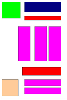
I have been asked to create a front page and contents page for a school magazine as a preliminary task. I must admit that at first I had a bit of a mental block, I had no idea how I was going to structure this, what content I was going to place into it and most importantly who can I get pretty enough to model for my images? However after I sat down for a while and thought through this more carefully I came up with some rough ideas as to how I would like my preliminary task to go.
This is my rough outline of how I would like my front cover to be laid out, although I do admit it may look like just a bunch of colourful shapes rammed into a square but bear with me, there is a sense of logic behind my rainbow coloured masterpiece. I have colour coded each area so that there isn’t an array of lines scattered around pointing to each individual square because with my simple mind something like that could become confusing very quickly. I mean what would you rather see? A plan representing a millipede that digs around in dirt and muck or an elegant bright butterfly that floats about freely in the clean, fresh air?
Okay I should get to the point because I have swerved off course a bit. Below is a colour key for my plan. Each colour below represents the respective coloured boxes in my plan.
- Magazine title
- School logo
- Headlines
- Article content
- Image to go with article
I have chosen to layout my cover like this as it allows for quite a lot of text to be included in the first two articles on the page. It also gives me some room to play about with images and so on to make my newsletter more interesting and interactive as parents and students alike will be able to see photos of people they may know on the front page and therefore will be more inclined to read through to see if there is more relevant articles to themselves inside the pages. For the articles i feel that as i am attempting to place two articles onto the front page i may not be able to include a huge amount of textual content. Therefore I may have to resolve to placing a ‘continued on page 18” for instance just to enable me to fit both articles in as i do not want the bulk of the front page to be taken up with one long article as I know from my years in school there was no way I would be reading that.
As for my contents page I would like it to be structured similar to this:
- Title for the contents page (I think that there is a high chance it will just say contents or contents page)
- A list of the newsletter content
- Page numbers for the mentioned articles and images to go with them
I feel that I want to keep the contents page short, sweet and clear so that students and parents are able to take a quick glance and view which news most affects them or involves them. They can then clearly see which page to turn to in order to indulge on the new exciting events occurring within their school.


No comments:
Post a Comment