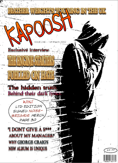
This is my first draft for my front page. I do not think it looks too bad however i am not too certain on the empty space at the bottom. I feel i may need to include a strap line with another heading in or some information for the magazine in an attempt to not leave so much free space. Also after asking for feedback of 5 other media students all of them have said they did not like the angle of the logo so i will be looking to re-position the logo on my final copy. however i personally feel that the magazine so far is coming on well, i have managed to exploit the left third of the magazine for its full potential and have managed to stick to a colour could of red black and gold both to represent darkness and hatred (main article theme) and the gold to represent glamour and success.
This is my rough draft of the contents page. i have received a lot of positive feed back from my peers on this page and i am relatively happy with the way it looks myself. However i think there is a couple of things i would like to change. I believe there is too much white on the page so i may attempt to place coloured backgrounds on all of the main text (news, Reviews etc.) which will not only make the page seem less spaced out but it will also further improve the texts ability to stand out. i would also like to frame the images on this page so they have borders making the page seem more tidy and professional.
This is my rough draft of my double page spread. As you can see i have my main image taking up the majority of the left hand page and the article taking up the right side. I did attempt to make the image cross over into the right page however i found it insufferably hard try to squeeze enough room for the writing in a big enough font size without ruining the resolution of the text making it unreadable without zooming in. I personally feel there is again a bit too much space on the page and i would like to to place a quote from the article in bold letters on the left hand side over the image. i feel there needs to be a mini introduction to the band on the right hand side just before the article and i believe i could also improve it by introducing bonus content into the page either through a website address or email address.


No comments:
Post a Comment